Where do you get your news? According to a recent article and interactive map featured on Forbes.com, that all depends on where you live. And we don’t mean because your local paper has the market covered.
A service that shortens URLs and allows for link tracking and analysis, Bitly recently mined data from millions of clicks on abbreviated and shared links to determine just where residents of the United States are heading for news and information. The data scientists who performed the analysis looked for news sources and individual articles that were unusually popular in certain states compared to national averages.
Bitly was able to do this because, as they say, “When you share or click a link on a social network like Facebook or Twitter, you’re most likely using a Bitly link. Bitly provides the infrastructure for social sharing across networks, and in the middle, collects a huge amount of data on how real people share ideas.”
Some of the results of the analysis are fun and occasionally surprising, while others are a bit more predictable. It’s important to remember what this data is really showcasing — not the demographic reading the article, but the demographic clicking on a Bitly link to the article.
While we like to think that everyone is exposed to Bitly links through social media interactions, not everyone is so plugged in. As a result, maybe it’s only the USA Today readers in Nevada that are clicking on Bitly to read articles, but more Nevada residents are actually reading CNN on their own. Maybe Huffington Post readers in Tennessee are simply more compelled to share what they’re reading through Bitly than New York Times readers. Because of this, it’s difficult for this data to be comprehensive. However, so long as we remain aware of what the data really indicates, this colorful map is quite a handy tool from a PR perspective.
One interesting observation is that the Washington Post’s interview with Joe Paterno about the Penn State scandal was a big hit in Tennessee and Alabama, while that paper’s general influence is contained to Maryland, Virginia and Kentucky. It’s observations such as this that just might change the way you think about your media outreach.
National coverage is great, but this map urges you to think about what “national” really means. And furthermore, this map is really telling us where news is being accessed via Bitly, something that’s very relevant to PR professionals as our goal is to find ways to spread information as effectively as possible, often with the help of social media. Which outlet’s articles were relatively popular in nearly every state? USA Today. Do you want to achieve national coverage, but Oregon is the heart of your story? NPR is your place.
Forbes will be updating the map monthly to assess the previous month’s hits, and it will be interesting to see how these maps morph, if at all. Maybe we’ll start to see more of a trend emerge as to who is reading which articles from which outlets.
In the meantime, it’s a pretty entertaining feature that you just might want to take a peek at when it comes pitching time.
Filed under: Uncategorized | Tagged: bitly, cnn, dvl, facebook, forbes, huffington post, interactive map, new york times, npr, pradical, public relations, twitter, URLs, USA Today, washington post | Leave a comment »


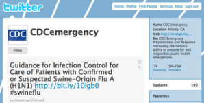
 NPR has reported two excellent yet contrasting stories this week regarding Twitter and the swine flu scare. The first points out the immediate nature of Twitter has facilitated an unnecessary panic by a misinformed public. The second details how the Center for Disease Control (CDC) has now embraced Twitter and is effectively using the tool to combat the misinformation and to establish online relationships with bloggers, journalists and public health officials. The CDC currently has over 50,000 subscribers following their updates. (Note: at the time of this post subscribers were at 50,000 – as of 7/21/09 subscribers are at more than 580,000)