Twitter Wins During Presidential Debate

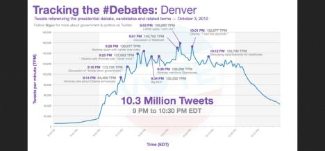
The first presidential debate took place last night at the University of Denver between U.S. President Barack Obama and Republican Presidential Candidate Mitt Romney.  It’s no secret that Twitter users “tweet in” for current events, and last night’s showing proved no different with more than 10 million tweets during the 90-minute debate, making it the most tweeted about event in American political history.

On its blog last night, Twitter released a minute-by-minute chart displaying high and low messaging points during key moments of the debate.

Twitter Blog: Presidential Debate Breaks Records, October 2012

Via Blog.Twitter.com

The night’s most tweeted about subjects included the performance of debate moderator John Lehrer and Big Bird. The Twitter Government account, @gov, tweeted that the phrase “Big Bird” had generated about 17,000 tweets per minute.

With every current event, there is always a PR lesson to be learned.  The iconic home appliance brand KitchenAid discovered this quickly last night after an irresponsible tweet was sent from the company’s official account. The brand issued an apology soon after via Twitter and later to media.

With Twitter’s crisis communication moments and the constant stream of conversation, outlets like Politico seem to think that Twitter jumped the shark last night with the inability to follow comments due to the overwhelming volume of tweets sent. Of course some would disagree, as Twitter continues to prove that watching live and current events with the Twitter community has become a part of the culture for many.

Facebook’s Zuckerberg Wears Hoodie to IPO Meeting: What’s *Your* Style Statement?

As Mark Zuckerberg turns 28 and gears up for Facebook’s initial public offering, he is also making headlines for another reason – his hoodie.

The Facebook co-creator and chief executive caused quite an uproar last week when he donned a hooded sweatshirt to meet with potential investors on Wall Street. News and opinions about the now infamous hoodie spread like wildfire, and it even has its own Twitter handle. Some say it was a lack of respect, a mark of immaturity, an act of rebellion. Others say it was sign of strength for the Facebook brand, a steadfast statement of individuality, a testimony to youthful self-confidence.

Zuckerberg hasn’t made a public statement about his fashion choice, and I am sure he won’t, but you have to believe that the billionaire knew exactly what he was doing when he got dressed that morning.

Branding matters, and that rings true for both companies and individuals. The way you present yourself can have a profound impact on the message you are trying to communicate. Make sure your personal appearance matches the image you want to project regardless of if it’s one of rebellion or one of respect.

After all, there is a lot of truth to the statement “image is everything.”

What Are Your Neighbors Reading? Bitly Will Show You

Where do you get your news? According to a recent article and interactive map featured on Forbes.com, that all depends on where you live. And we don’t mean because your local paper has the market covered.

A service that shortens URLs and allows for link tracking and analysis, Bitly recently mined data from millions of clicks on abbreviated and shared links to determine just where residents of the United States are heading for news and information. The data scientists who performed the analysis looked for news sources and individual articles that were unusually popular in certain states compared to national averages.

Bitly was able to do this because, as they say, “When you share or click a link on a social network like Facebook or Twitter, you’re most likely using a Bitly link. Bitly provides the infrastructure for social sharing across networks, and in the middle, collects a huge amount of data on how real people share ideas.”

Some of the results of the analysis are fun and occasionally surprising, while others are a bit more predictable. It’s important to remember what this data is really showcasing — not the demographic reading the article, but the demographic clicking on a Bitly link to the article.

While we like to think that everyone is exposed to Bitly links through social media interactions, not everyone is so plugged in. As a result, maybe it’s only the USA Today readers in Nevada that are clicking on Bitly to read articles, but more Nevada residents are actually reading CNN on their own. Maybe Huffington Post readers in Tennessee are simply more compelled to share what they’re reading through Bitly than New York Times readers. Because of this, it’s difficult for this data to be comprehensive. However, so long as we remain aware of what the data really indicates, this colorful map is quite a handy tool from a PR perspective.

One interesting observation is that the Washington Post’s interview with Joe Paterno about the Penn State scandal was a big hit in Tennessee and Alabama, while that paper’s general influence is contained to Maryland, Virginia and Kentucky. It’s observations such as this that just might change the way you think about your media outreach.

National coverage is great, but this map urges you to think about what “national” really means. And furthermore, this map is really telling us where news is being accessed via Bitly, something that’s very relevant to PR professionals as our goal is to find ways to spread information as effectively as possible, often with the help of social media. Which outlet’s articles were relatively popular in nearly every state? USA Today. Do you want to achieve national coverage, but Oregon is the heart of your story? NPR is your place.

Forbes will be updating the map monthly to assess the previous month’s hits, and it will be interesting to see how these maps morph, if at all. Maybe we’ll start to see more of a trend emerge as to who is reading which articles from which outlets.

In the meantime, it’s a pretty entertaining feature that you just might want to take a peek at when it comes pitching time.